This week I came across a site called https://theuserisdrunk.com/ which is a user testing service which is conducted whilst drunk! The founder Richard Littauer identified that interacting with a website whilst drunk provided different feedback in comparison to being sober and could provide an analysis of how ‘usable’ your site was from a completely different perspective. Initially I thought that this was a ridiculous idea but then quickly realised that not only does user behaviour change drastically when you have had a few to drink but also the regularity that users will interact with your site whilst under the influence is quite common. If Richard Littauer can audit your website after a couple of pints with no problems then its safe to say the majority of sober users will find it a breeze.
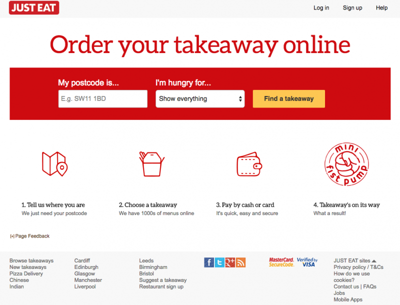
This got me thinking. Are there certain industries/websites that could really benefit from this type of analysis? The first thing that came to mind was take away website like Just Eat. After returning from the pub one of the most popular activities is ordering food, so for Just Eat being able to order food whilst drunk is a vital part of their business. Well I’m not sure that Just Eat will need the help of Richard Littauer because they have made a site that (providing you can see) is so user-friendly that even the most alcoholic of users can order a takeaway. They have achieved this by following some of the key rules in landing page optimisation, lets take the homepage as an example:
- Make your main heading messaging focused on the single goal.
- Seems simple but making a complete stranger able to understand the purpose of your site in under 5 seconds is essential. The main heading “Order your takeaway online” achieves this well. Its big, its bold and you cant miss it!
- Use contrast on your main CTA to stand out from the rest of the page.
- Underneath the title you have the postcode field, the takeaway dropdown and the main CTA (find a takeaway) not only in a prominent position but behind a bright red container with the ‘find a takeaway’ CTA button clear as day.
- Explain how your service works concisely.
- The four stage process underneath the CTA is clear, simple and lets the imagery do all the talking with only minimal text to accompany.
Just Eat have gone to great lengths to make their homepage as simple, clear and user friendly to get people started on their quest for a takeaway as quickly and easily as possible. Selecting your food comes first, registration later as it should. Other elements such as making forms as short as possible, consistency in branding/colours (e.g. the yellow CTA stays the same throughout), simple filtering and a seamless checkout process have resulted in a “drunk proof” user experience.
Clearly there are more elements to a good user experience than the three points above, I will go into more of these in future blog posts. However in most cases doing the basics well goes a long way and CRO is no different. So what other sites are the first port of call whilst under the influence? Without having the statistics I would say perhaps social media platforms (Twitter is a good example) or maybe a dating website (Match for instance) are other examples where the three points above are used very well. Go have a look at Twitter’s or Match’s homepage and you will see what I mean.
I would like to go back to the original question, Is drunk user testing the future of CRO? No, certainly not universally across all cases but it could be very useful for some industries and potentially more enjoyable. Providing you don’t have too many!
What do you think? Let us know your thoughts in the comment section below. StrategiQ Marketing promotes responsible drinking and awesome landing page optimisation!
To discuss UX and CRO with StrategiQ Marketing get in contact today.


